
HydroPros Power Washing
Rock Hill, SC
HydroPros, a customer-focused power washing startup, is dedicated to providing top-notch services across two states. Specializing in revitalizing residential and commercial properties, HydroPros aims to deliver exceptional results while prioritizing customer satisfaction. Utilizing advanced equipment and environmentally friendly techniques, their skilled team effectively removes dirt, grime, and mold, leaving properties looking fresh and renewed. With a commitment to excellence, reliability, and its customers, I aimed to communicate these core values through its new brand identity.
Proposed Business Card Showcase
HydroPros Power Washing Brand Showcase
Branded Doorhanger Promotional Showcase
Concept to Digital Product
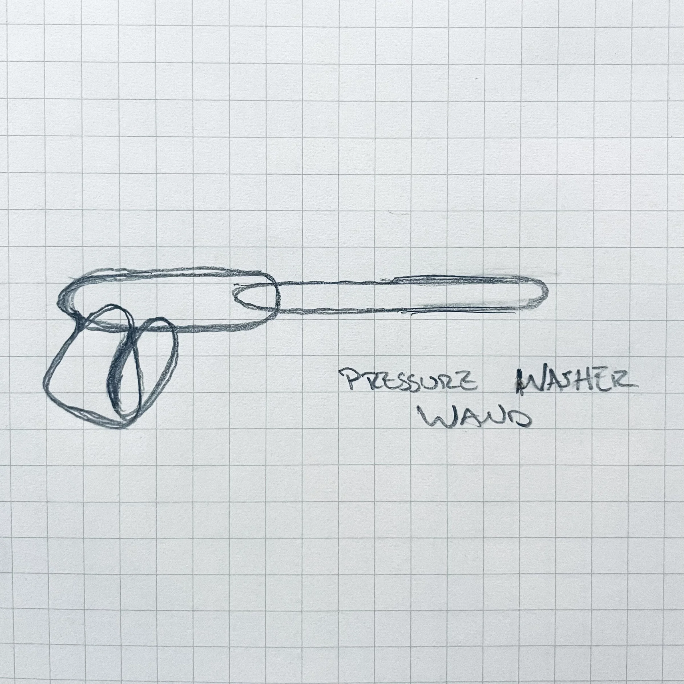
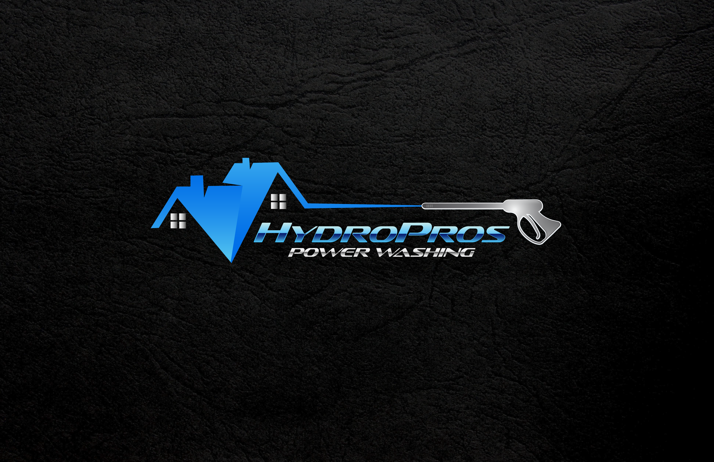
A power washing wand was integral in the design to quickly showcase what the business was all about without stating it directly. This was to allow for the use of “HydroPros” alone in merchandise and promos.
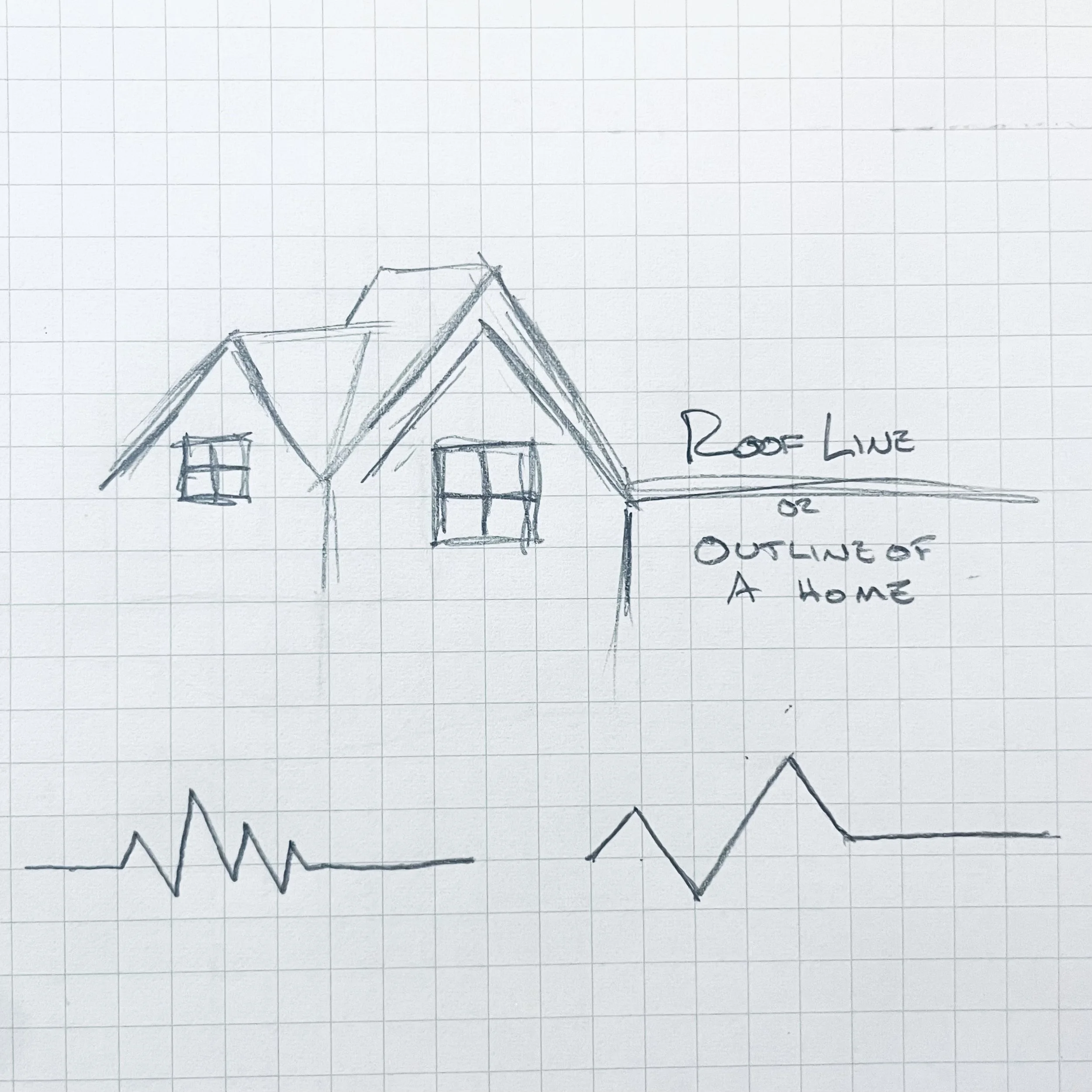
While sketching rooflines, the idea of a heartbeat came to mind. Your home or business is your lifeline and that needed to resonate in the final design.
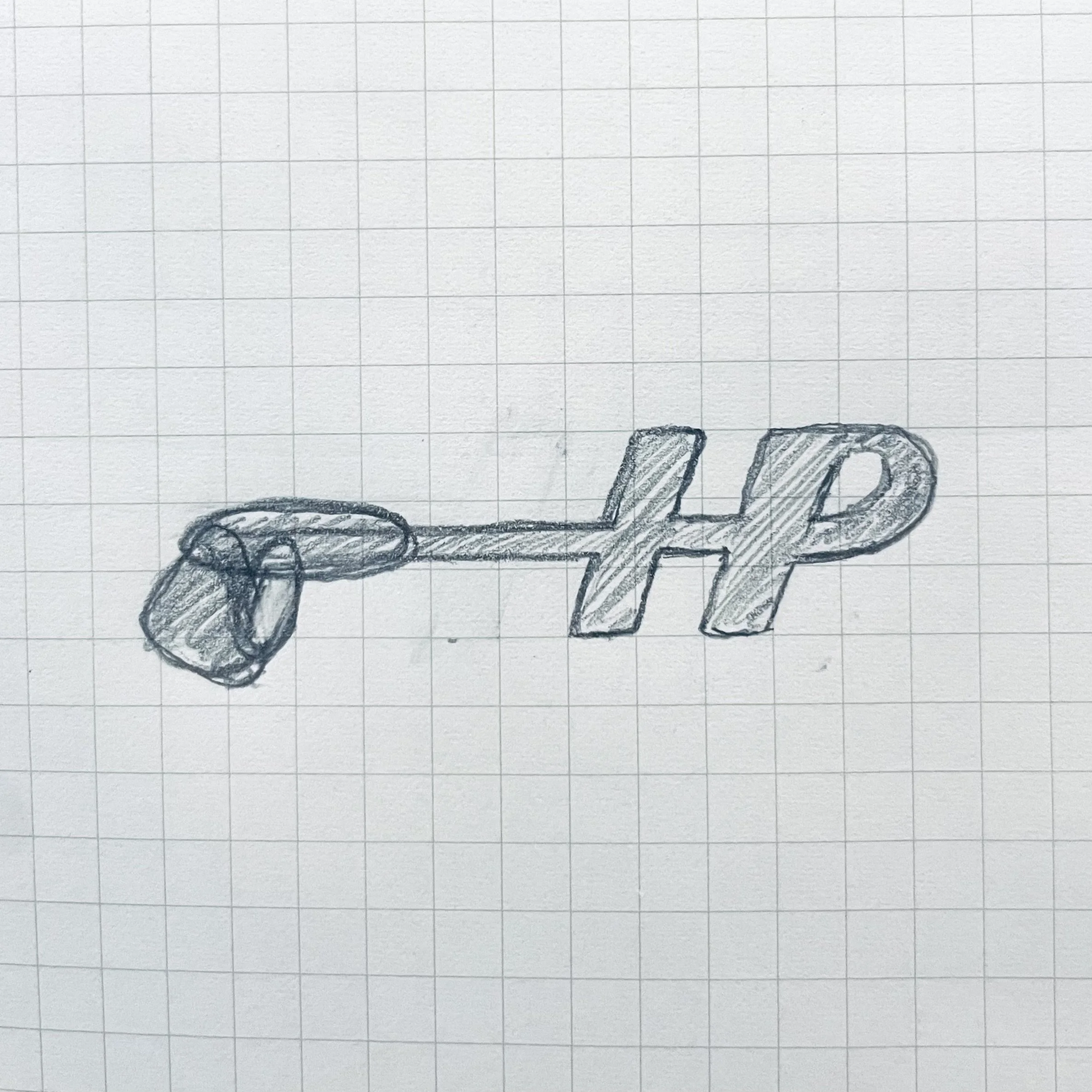
A quick sketch while deciding on a typeface led to the design of HydroPros secondary logo and favicon. The seamless integration of the HP and wand was a natural fit.
Final Print File
Final Product MockUp
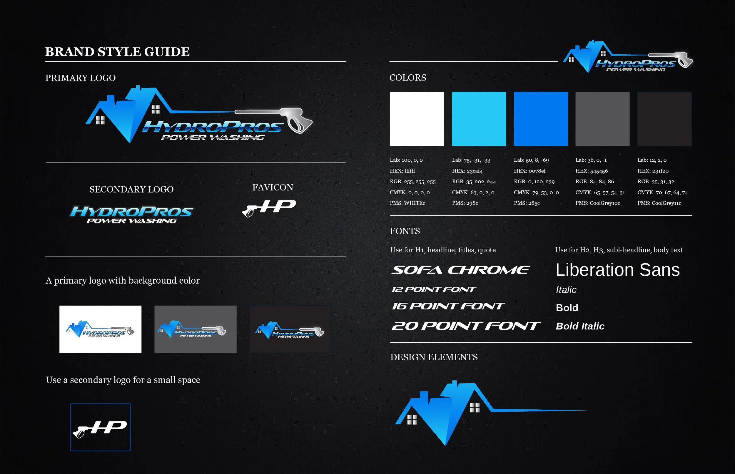
The brand design styling for HydroPros Powerwashing is a vibrant representation of their identity. In response to the customer's request, a striking blue color palette has been incorporated, symbolizing trust, reliability, and a sense of freshness. Complementing the color scheme, a robust italic font has been chosen to evoke a feeling of forward movement and to emphasize the power of water in their services. This carefully crafted brand mark effectively captures the essence of HydroPros' core business values, leaving a lasting impression that is both memorable and visually engaging.